Apple's Glass Façade: Why the New iOS 26 and macOS Design is a Beautiful Mistake
Author: Aleksei Beltiukov
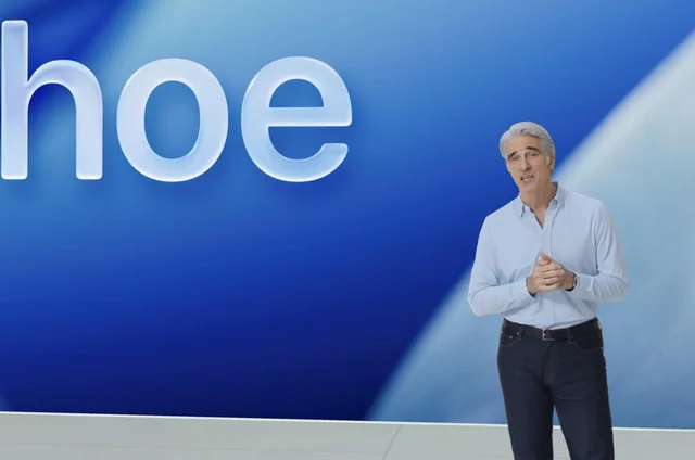
Every June, the tech world holds its breath for WWDC, and 2025 was no exception. Apple rolled out a whole host of updates, but the star (or villain?) of the show wasn't a new gadget, but a radical redesign of all its operating systems called "Liquid Glass." The company hailed it as the most significant update since iOS 7.
But, as they say, the devil is in the details. And it seems that in its pursuit of a futuristic aesthetic, Apple has stepped on the old, painful rake of poor usability. Let's break down what's wrong with this glassy future and why the community has met it with a mix of excitement and skepticism.
The Year 2026 and the Liquid Glass Aesthetic
First, the formalities. Apple has decided to end sequential numbering and has switched to naming its OS by the year of use. So, instead of iOS 19, say hello to iOS 26. The logic is similar to EA Sports with their FIFA franchise—the system is released in the fall of 2025, but its main lifecycle will be in 2026. Along with it came iPadOS 26, macOS 26 "Tahoe," watchOS 26, and others.
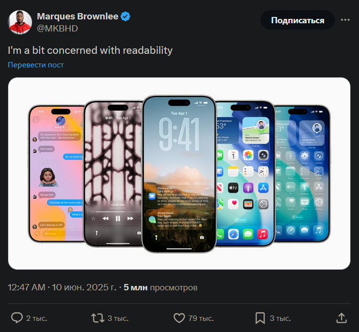
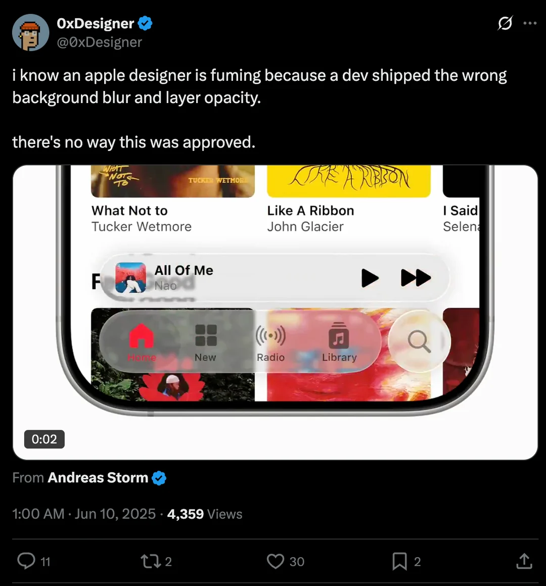
The new "Liquid Glass" design system, inspired by the Vision Pro's interface, permeates all platforms. Translucency, dimensional elements, shadows, light refraction — it all looks spectacular in promo videos. More information about Liquid Glass in Apple's video here. But when it comes to real-world use, this glass carriage is at risk of turning back into a pumpkin.
Design vs. Accessibility: The Core Paradox of Liquid Glass
Accessibility experts were the first to sound the alarm. The new design, with its translucent layers, is a direct blow to the WCAG (Web Content Accessibility Guidelines) standards, which demand clear contrast between text and background.
When your notification pops up over a busy wallpaper, the text can become completely unreadable. This creates problems for everyone, but especially for:
- People with visual impairments: They might simply miss important information.
- Users with dyslexia: The visual noise from the see-through background makes reading more difficult.
- People with attention disorders: The multiple layers and animations become a major distraction.
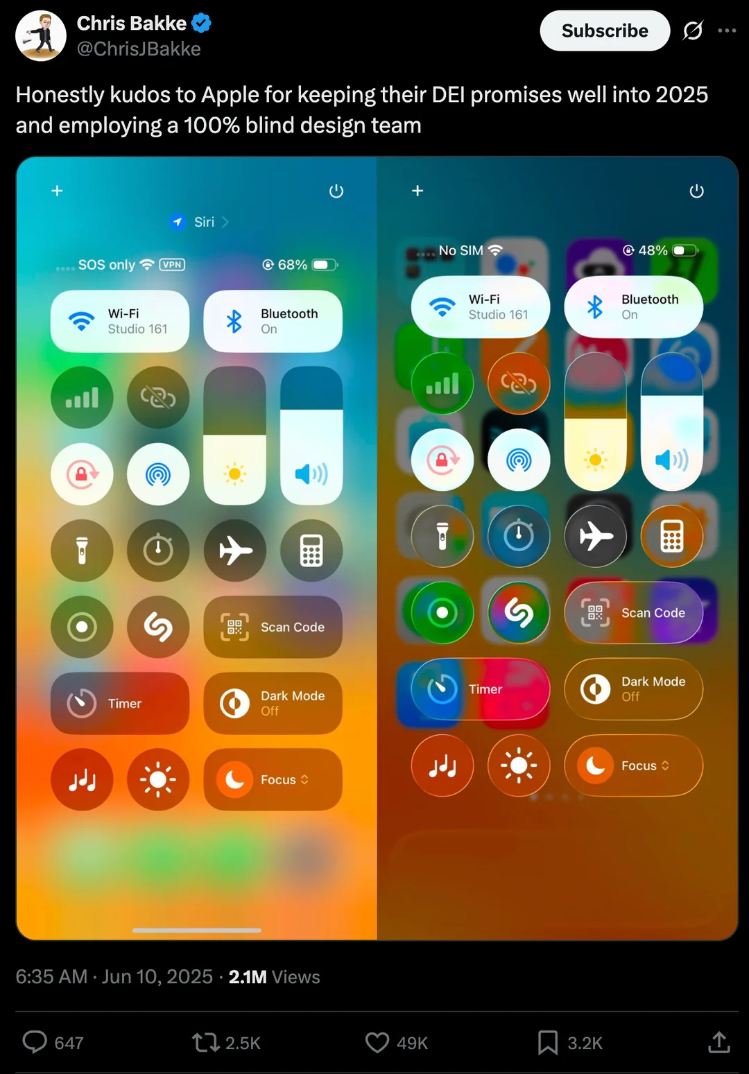
Yes, Apple included a "Reduce Transparency" option. But this isn't inclusive design; it's more like a main entrance and a side door labeled "accessible." Instead of creating a universal interface, the company is offering a compromise that undermines the entire aesthetic concept.
Competitors didn't miss a beat: the official Windows TikTok account responded with a snarky video captioned, "Y'all good???"
Déjà Vu from 2016: Why Liquid Glass is a Mistake We've Seen Before
The most interesting part is that the industry has been down this road before. A story surfaced on Reddit from the Akveo team, who created an open-source dashboard template called Blur Admin back in 2016. It used very similar blur effects and was incredibly popular... until people started implementing it in real-world projects. The demo can be checked here.
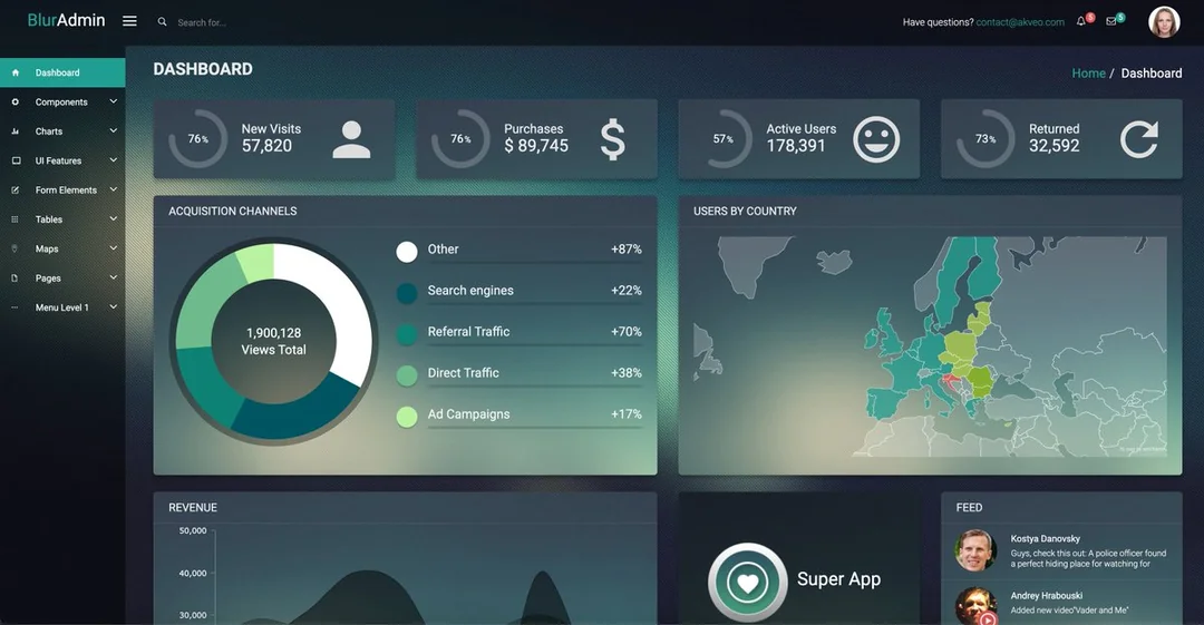
The developers ran into the full suite of problems that experts are now predicting for Apple:
- Illegible text due to floating contrast ratios.
- Disappearing UI elements on complex backgrounds.
- Poor performance even with CSS's
backdrop-filter. - User complaints of dizziness from the animated transitions.
Ultimately, the project had to be shut down. Now, looking at Liquid Glass, the original poster asks a reasonable question: did Apple really not learn from this experience and decide to repeat the same mistakes, only on the scale of its entire ecosystem?
The Voice of the People on Reddit: From Love to Hate
Early beta testers have already shared their impressions, and their opinions are extremely polarized.
iOS 26: Beautiful, But Painful
Some users are thrilled with the fresh look and smooth animations. But most agree that readability has dropped to a critical low. Text on widgets and in the Control Center becomes illegible in bright sunlight or against colorful wallpapers. Some compare the new style to themes from the early jailbreak era or the Windows Vista interface—a dubious compliment.
macOS 26: A Failure in the Vein of Windows 8
The desktop system has suffered even more. "Floating" translucent sidebars and menus eat up valuable screen real estate and are distracting. Many are drawing direct parallels to the failure of Windows 8, when Microsoft unsuccessfully tried to force a mobile interface onto the desktop. According to some, macOS is turning into a "collection of half-finished projects."
watchOS 26: A Total Disappointment
Here, it's simple: the update was called "very underwhelming." The new "Workout Buddy" is a feature nobody asked for, while truly important health-tracking improvements, like those found on Garmin devices, are still missing.
What Else is in the Box? Goodbye, Intel, and Hello, Gaming
Amidst the design battles, some important announcements were pushed to the background.
- The End of the Intel Mac Era. macOS Tahoe will be the last version to support Intel processors. This is the official sunset of the "Hackintosh" era and a powerful incentive to switch to Apple Silicon.
- Big Ambitions in Gaming. Apple introduced the Metal 4 graphics API with MetalFX Frame Interpolation (an analog to NVIDIA's Frame Generation) and Denoising for ray tracing. Thanks to this, AAA titles like Cyberpunk 2077 and Crimson Desert have been announced for the Mac.
The Final Word
Apple made a bold move, but it seems to have stumbled over the basic principles of usability. Liquid Glass is a prime example of aesthetics triumphing over common sense. Of course, this is only the first beta, and much could change by the fall release.
But the main question remains: is this a temporary lapse in judgment or a fundamental shift in Apple's philosophy, where form has finally won out over function? Given the company's influence on the entire industry, the answer will shape how the interfaces of the near future look and feel. And for now, that future looks beautiful, but highly impractical.